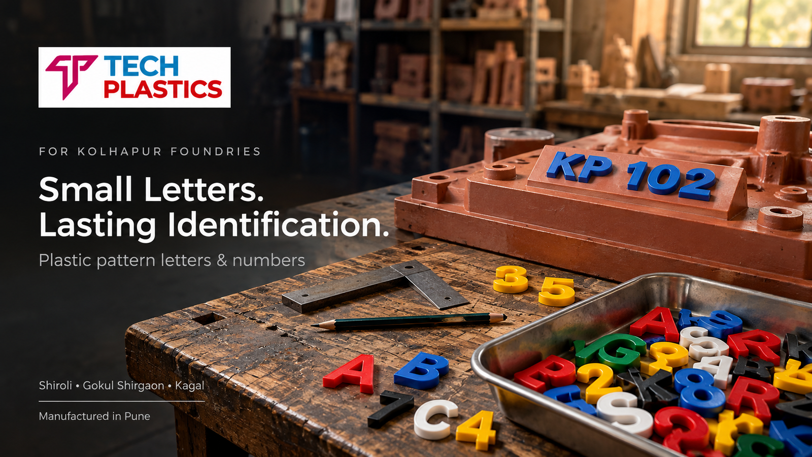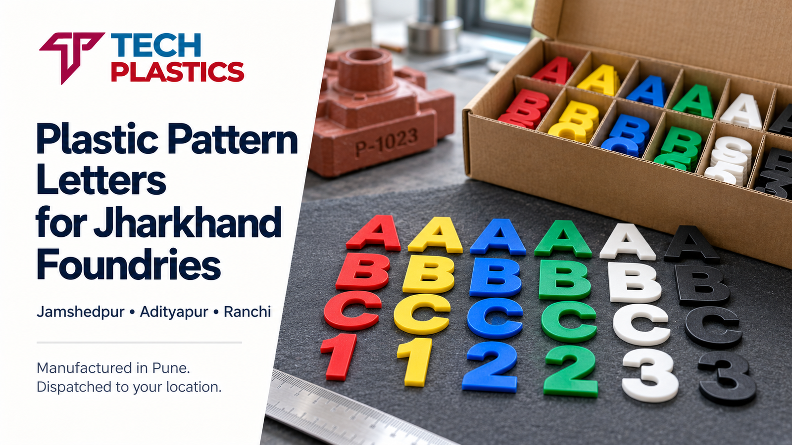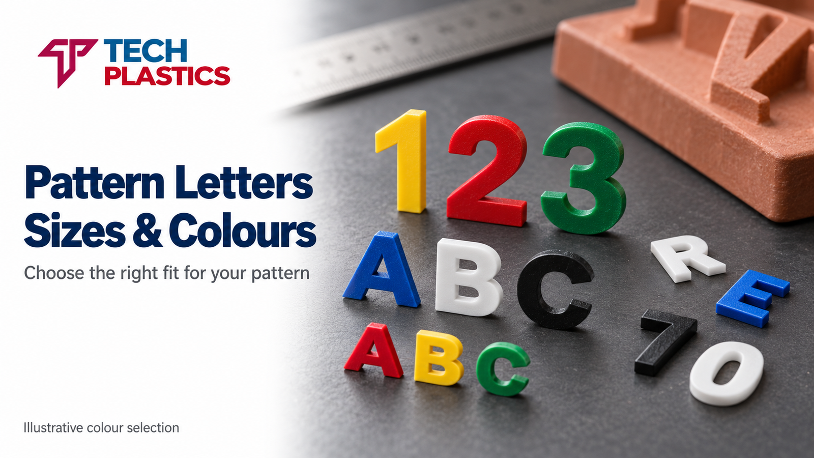
Picking the right size of foundry pattern letters and numbers is one of those pattern-shop decisions that looks trivial on paper and causes avoidable rework when it is handled casually. The character height, stroke thickness, profile and spacing you fix at the drawing stage will be moulded into every casting that pattern produces — often for the next decade.
This guide is for pattern makers, design engineers, quality teams and foundry production managers. It focuses on the practical sizing decisions that have to be made before a plastic letter set is ordered.
Why letter sizing is not a loose decision
Foundry pattern letters do two jobs at once. They have to transfer a readable raised (or recessed) character into the sand mould without the sand tearing or the character distorting. And they have to produce a casting mark that remains legible after the finished casting has been shot blasted, fettled, machined on reference faces, primed and painted.
Both jobs depend on the geometry of the character — height, stroke width, side draft, corner radius and spacing. Get these wrong and the finished mark either breaks up during moulding or disappears under paint. Get them right and the same pattern delivers readable identification for years.
Letter height
Height is the first decision because it drives almost everything else — stroke, spacing, pattern area required, and the degree of surface preparation the casting needs for the mark to show cleanly.
A commonly observed practice in Indian iron, SG iron and non-ferrous foundries looks something like this:
- 5–8 mm — small castings, cavity numbers on small match-plates, cover plates, covers and small pump bodies
- 10–15 mm — the workhorse range, used for part numbers, heat codes and foundry marks on medium automotive, pump and valve castings
- 20–25 mm — larger castings and marks that have to be legible from a few metres away
- 30 mm and above — heavy castings, manhole covers, large flywheels, decorative plaques and marker castings
These are observations from shop practice, not a published universal standard. The correct height for any specific casting depends on the available flat area on the pattern, the casting's own size and the viewing distance in the field. Shop practice is a starting point; the drawing and the pattern maker always get the final call.
Stroke thickness
Stroke thickness is often ignored on specifications, which is a mistake. If height is set but stroke is not, two suppliers can send apparently matching heights with very different weights of character.
A practical rule used in many pattern shops is to keep stroke width in the range of about 15–20% of character height for medium castings — thinner for small, finely-cast parts, thicker for rough iron casting surfaces where a thin stroke will disappear. For a 15 mm character, a stroke of around 2.5 to 3 mm is typical in sand casting work.
Why this matters:
- Too thin — the mark reads as a hairline on the casting; shot blasting erases it; paint fills it in
- Too thick — sand around the character does not pack cleanly, the casting mark looks bloated, and adjacent characters can run together
Character profile
Character profile is the three-dimensional shape of the letter seen from the side. Three features matter:
- Face flatness. The top of the character should be flat and parallel to the parting plane so that the mark on the casting has a defined top surface.
- Side draft. The sides must taper slightly outward from the face to the base so the sand releases cleanly without tearing. Insufficient draft is a common reason for broken characters on the casting.
- Base fillet. A small fillet where the character meets the pattern surface prevents sand breakage at the base and makes the mark more robust during finishing operations.
Good-quality plastic foundry letter sets are injection moulded with these features built in. If a batch arrives with square sides and no draft, it will not mould cleanly — it is a specification problem, not a sand problem.
Character spacing
Spacing — the gap between adjacent characters — follows height. If spacing is too tight, the sand bridge between characters is thin and tears easily, leaving the casting mark looking merged. If spacing is too loose, the mark reads as isolated characters rather than a cohesive part number.
A workable starting point used in many shops is to keep the inter-character gap at roughly 20–30% of character height, with a slightly wider gap after punctuation or between a part number and a date code. Spacing is also where the pattern maker's judgement matters most — the right spacing on an SG iron pattern is not identical to the right spacing on a rough green-sand iron casting.
Raised versus recessed identification
There are two ways a plastic foundry letter can be used on a pattern:
- Raised on the pattern → recessed on the casting. The character is glued or pinned onto the surface of the pattern, standing proud. The sand picks up the recess, and metal fills it, producing a recessed character on the finished casting.
- Recessed in the pattern → raised on the casting. The character is set into a milled pocket in the pattern so its face is flush or slightly below the pattern surface. The sand picks up a raised feature, and the casting shows a raised letter.
Both approaches are used across Indian foundries. Raised marks on the casting are generally easier to read on rough iron surfaces and survive painting better. Recessed marks are preferred where surface flow matters, or where the casting is going to be ground flush on that face.
The choice is a drawing decision made with the end customer and the pattern maker, not with the plastic letter supplier. The supplier's job is to produce clean, consistent characters that work in either arrangement.
Positioning on casting patterns
Where the characters sit on the pattern matters as much as how big they are:
- Keep lettering on a flat or near-flat surface, well clear of the parting line
- Position so the lettering face is parallel to the parting plane; the draft on the letter and the draw direction of the pattern must agree
- Leave a visible margin from fillets, bosses and ribs so the sand around the character packs properly
- For multi-cavity patterns, place the cavity number consistently so inspection can locate it quickly on each casting
A detail often overlooked: lettering positioned near a core print or a venting feature can interfere with sand compaction. The pattern maker should check this before the characters are fixed.
Pattern and moulding-process considerations
Different moulding processes favour slightly different lettering specifications:
- Green sand (manual or jolt-squeeze): classic plastic letter sets work well; sand strength is moderate
- Match-plate green sand (high pressure): characters must be solidly fixed; the ramming pressure is high
- No-bake / chemically bonded sand: sand is harder and more brittle; cleaner draft and good base fillets become more important
- Shell moulding: finer surface finish; smaller character heights (5–8 mm) are more usable than in green sand
- CO2 moulding: behaves similarly to no-bake in terms of character release
Readability on the final casting
A quick field-level test used in several foundries: can a floor inspector read the mark from arm's length on a shot-blasted, unpainted casting, under normal shop lighting? If yes, the lettering specification is adequate for that part. If not, the next pattern revision should move up by one height step or increase stroke thickness.
Readability is also affected by surface roughness (sand grade and metal pouring conditions), shot blast intensity and media, paint film thickness (heavy primer can bury thin characters), and viewing angle on the production line. These are casting-process factors; the lettering specification has to be chosen in light of them, not in isolation.
Drawing and approval
Before releasing a pattern-letter order, the drawing or specification should ideally fix: character height in mm, stroke thickness (either explicitly or by reference to a known supplier profile), font or profile, position on the pattern, raised or recessed on the final casting, and the character set with quantities.
For a first-time order with a new supplier, approving a single physical character before committing to a full set is the simplest way to lock the profile.
Pre-order checklist
- Is the height matched to the available flat area on the pattern?
- Is the stroke thickness realistic for the casting surface and the viewing distance?
- Does the character draft agree with the pattern draw direction?
- Are extra 0s, 1s and 2s included for date and heat codes?
- Is the supplier's profile the same as the existing stock, if this is a replenishment?
- Is a sample approval cycle planned for any new height or new supplier?
A note on standards
There is no single universal standard that mandates specific plastic foundry pattern letter dimensions across all casting applications. Sizing is driven by casting drawings, buyer-specific requirements and pattern-shop practice. Where a specific buyer or industry standard calls out a lettering dimension, that specification governs. Any reference to a specific Indian or international standard should be verified against the latest published version before use.
Tech Plastics manufactures plastic foundry pattern letters and numbers at its Moshi, Pune facility using plastic injection moulding processes documented under its ISO 9001:2015 quality system. Specific heights, stroke profiles and lead times are confirmed per enquiry.
Fixing the lettering specification for a new casting pattern? Tell Tech Plastics in Pune the character height, profile and quantities you need. The team will revert with a quotation and, where useful, a physical sample for approval before full-batch manufacture.